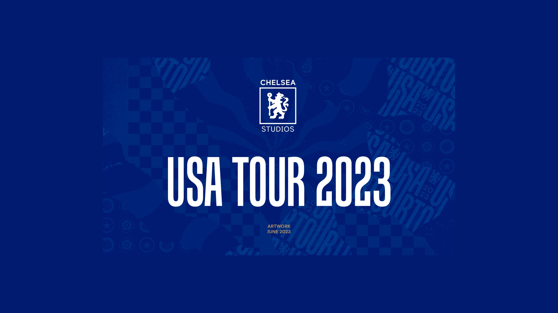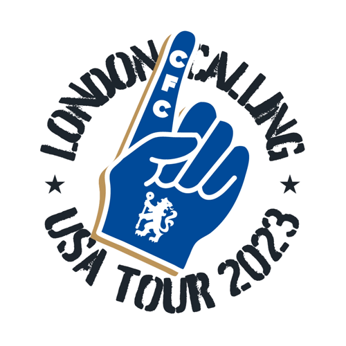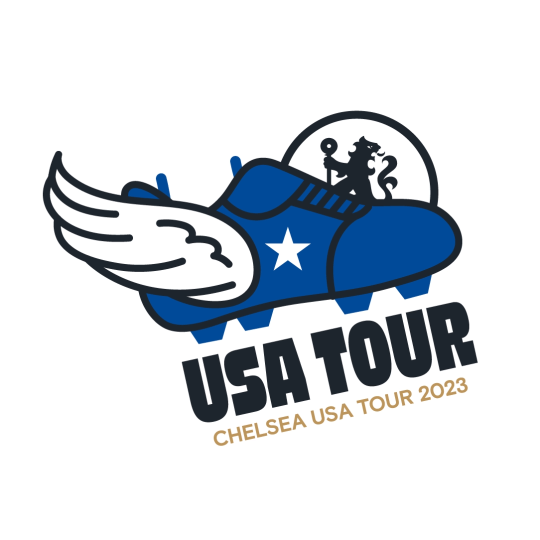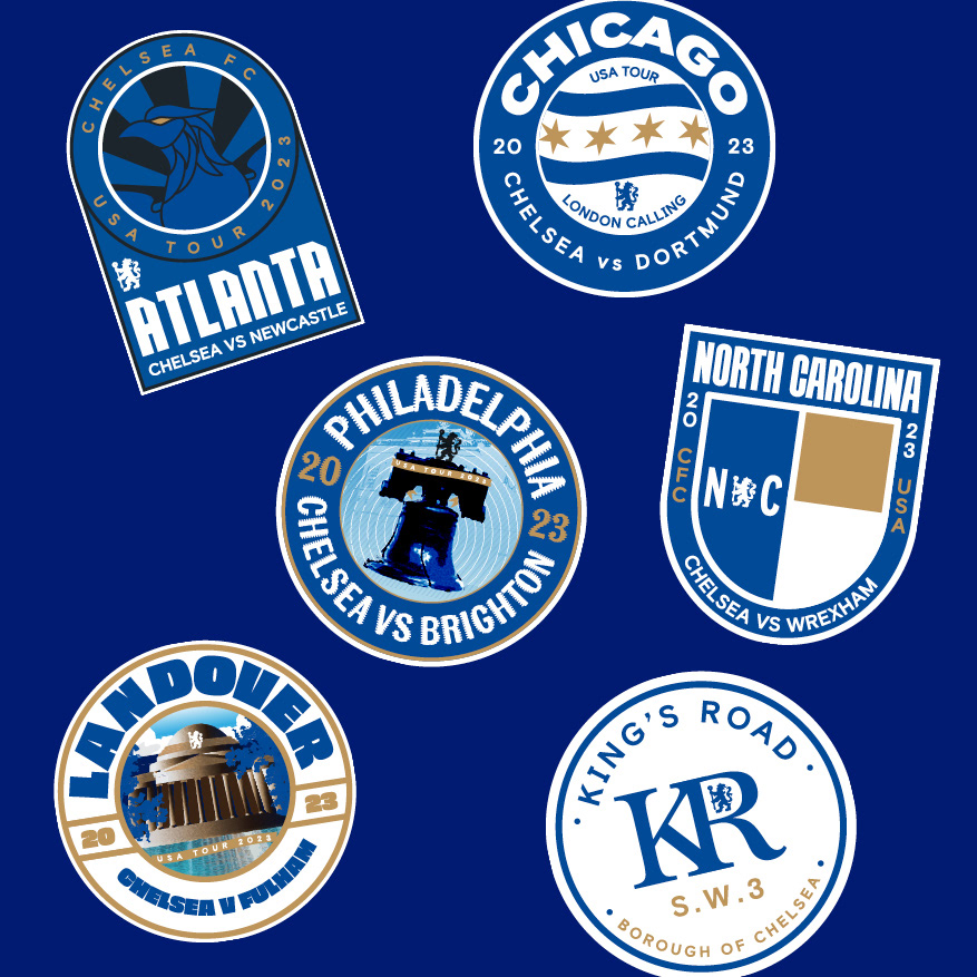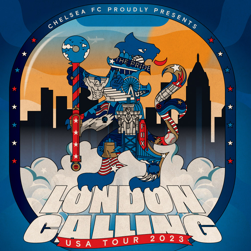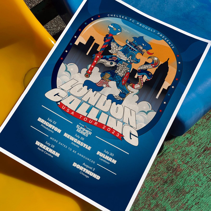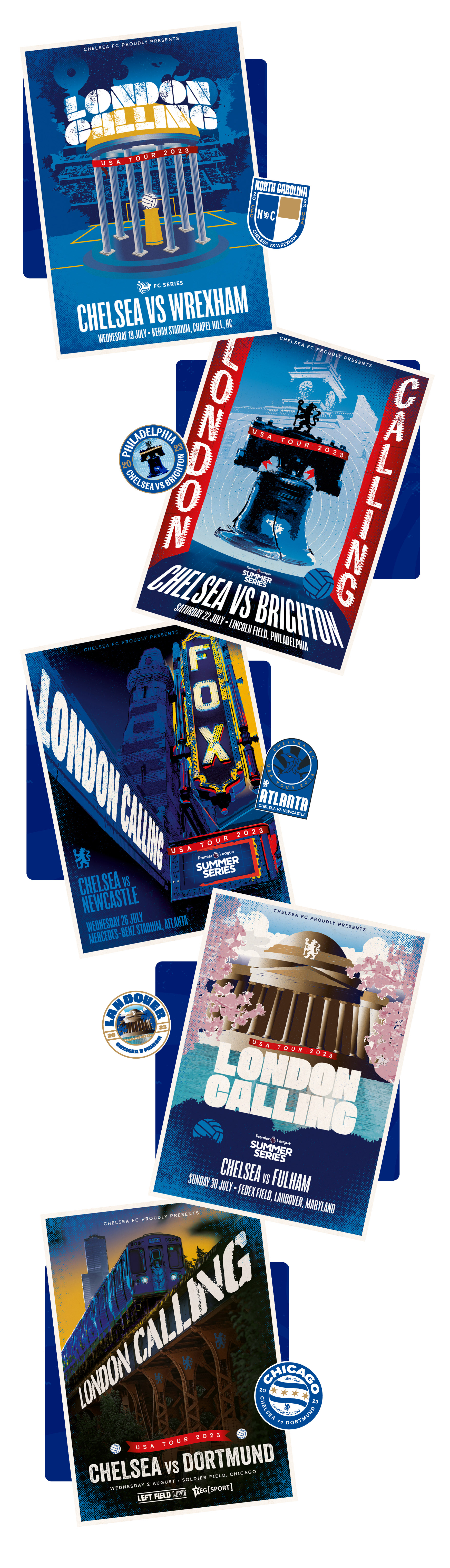
The Brief
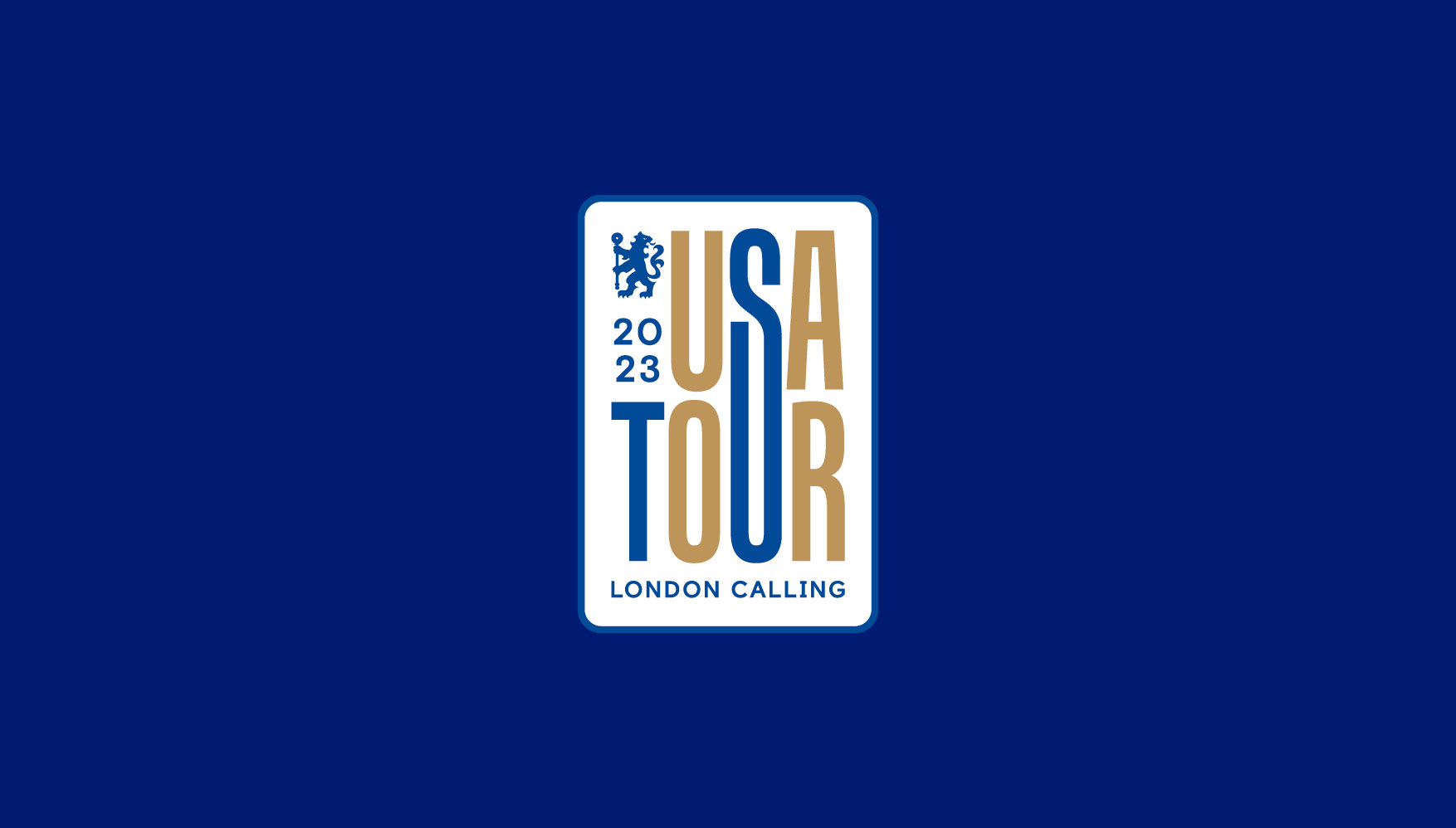
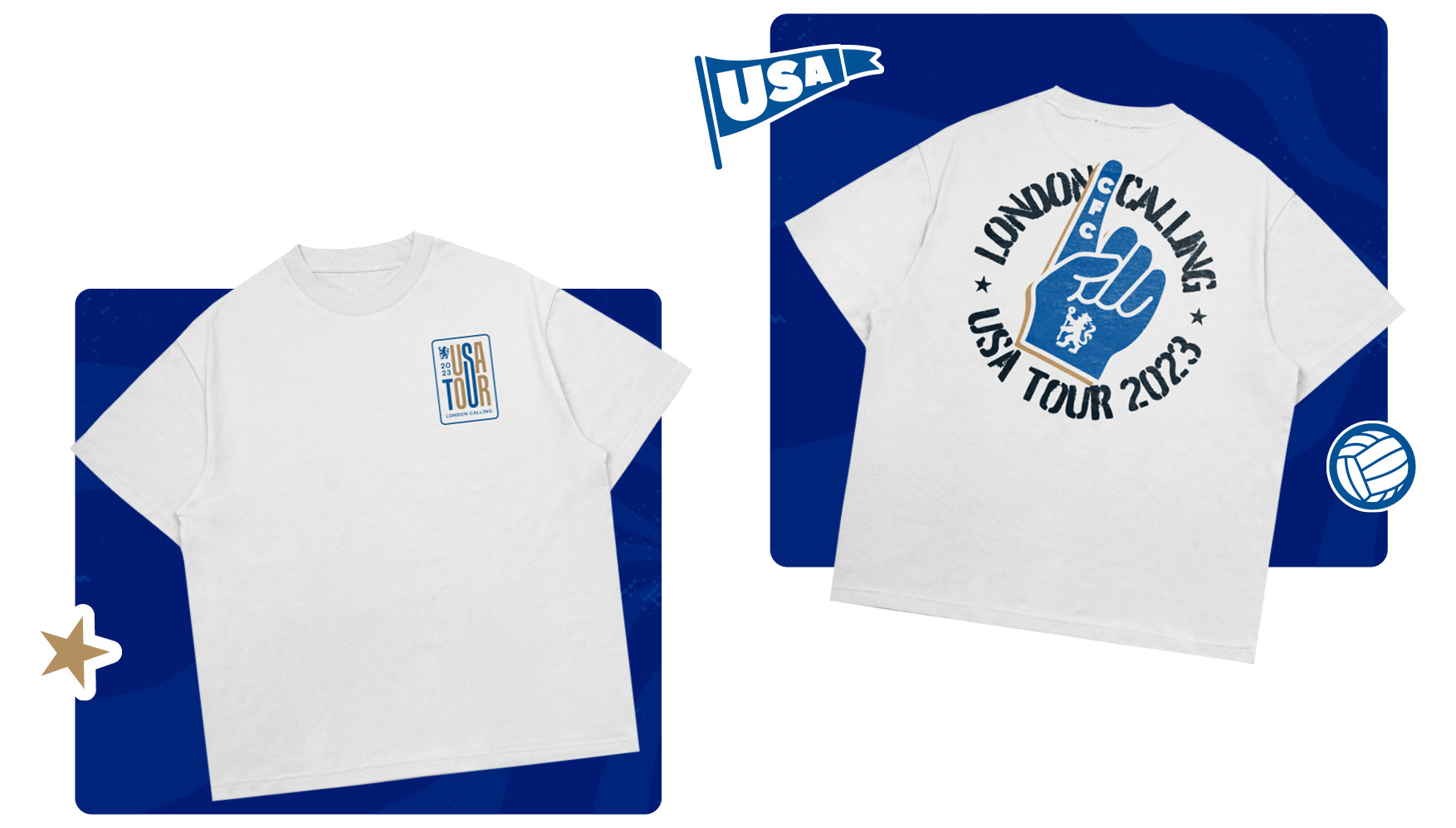
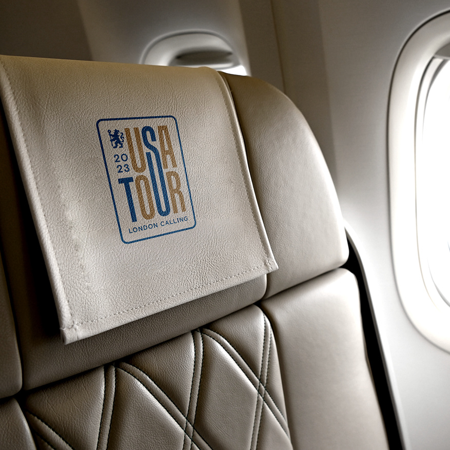
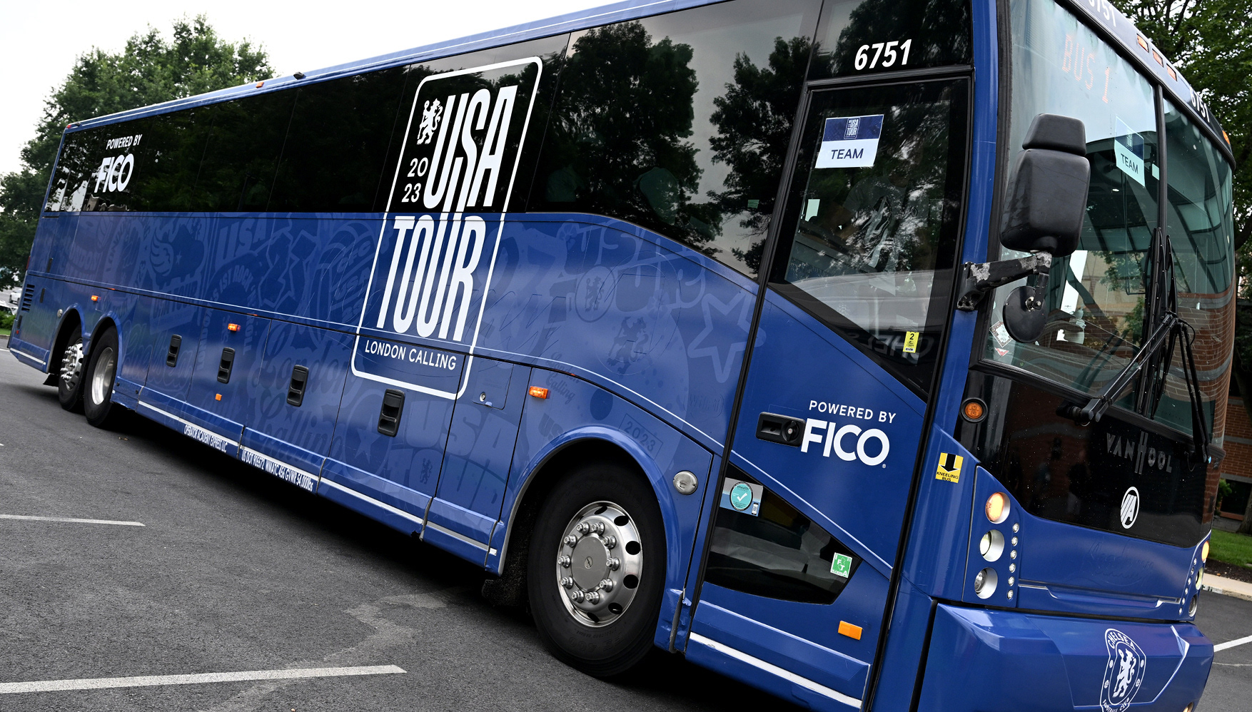
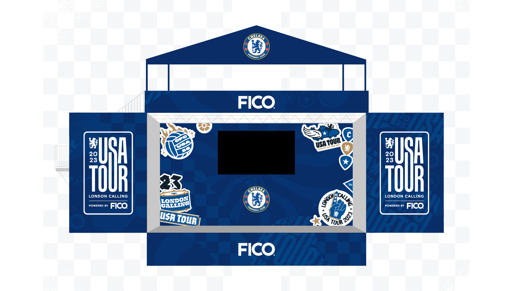
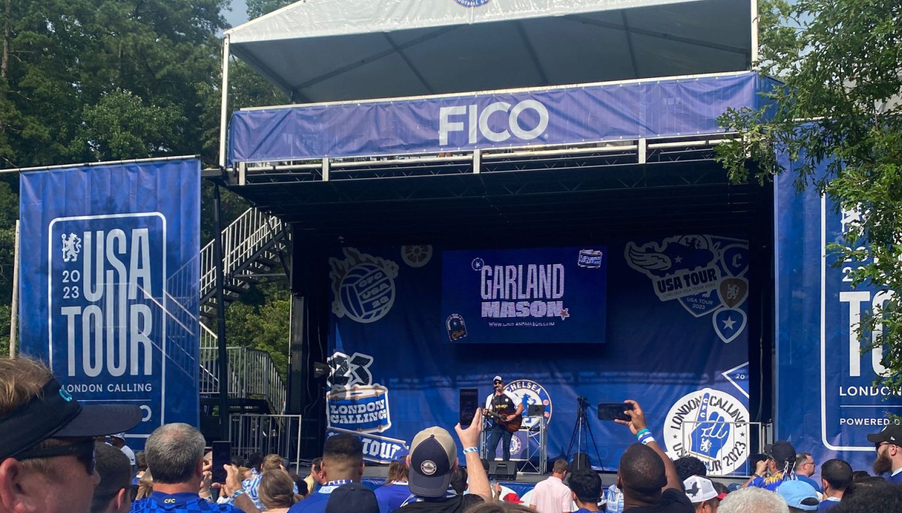
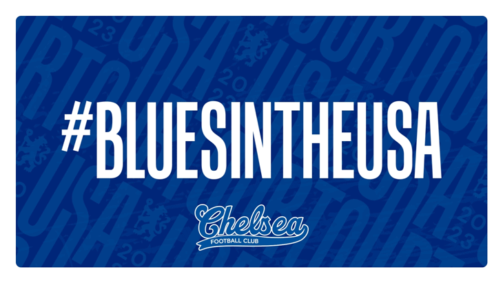
For our consecutive year in the US, we wanted to go bigger than ever before. This meant coming up with a visual identity that could be adapted for an extensive asset rollout from bus wraps, merchandise, fan zones, and stadium LEDs.
The Solution
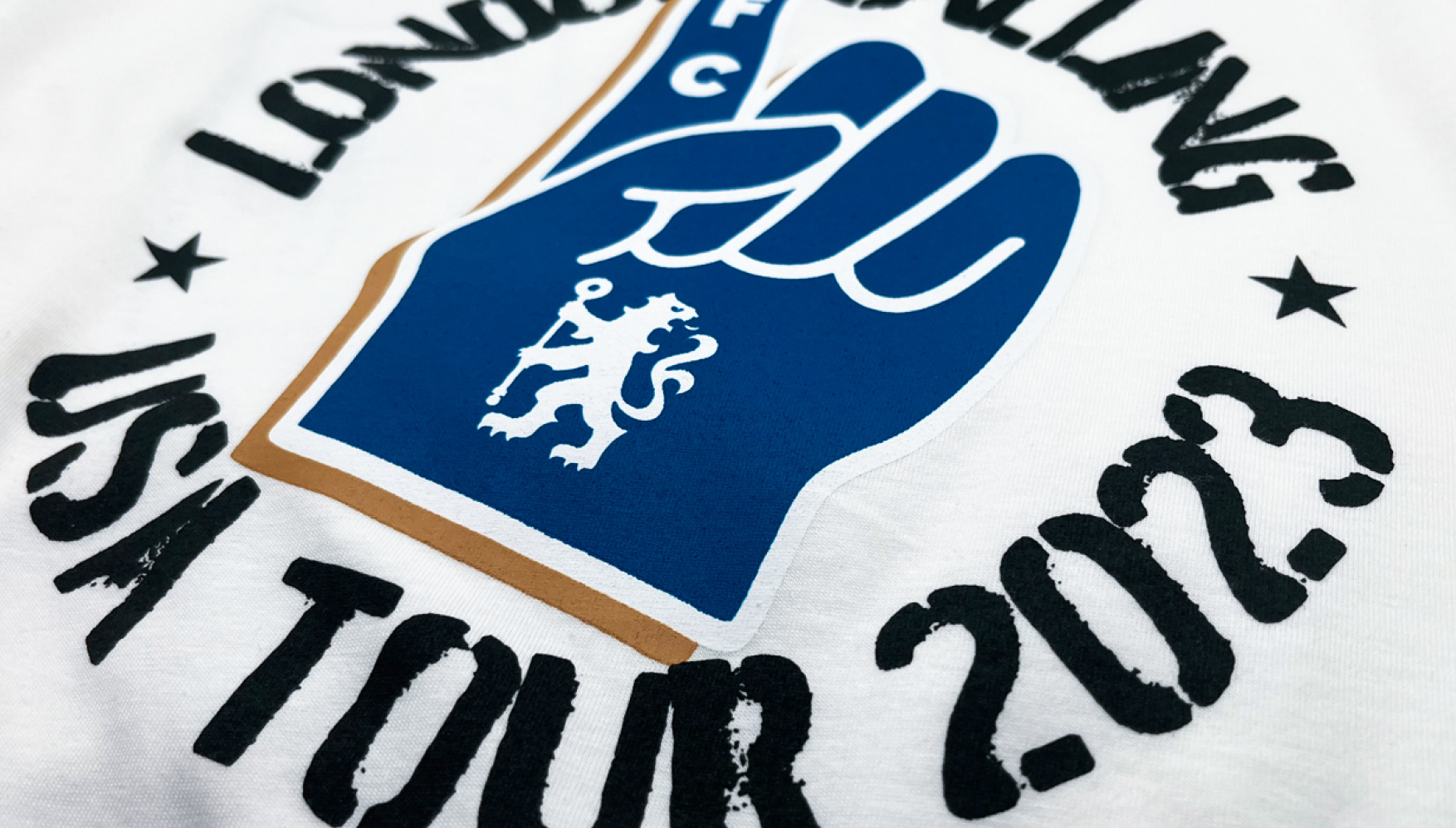
It was my responsibility to encapsulate London and British music, portraying the campaign as if Chelsea were embarking on a rock 'n' roll tour. Fusing our London style with American iconography that would attract new fans and excite our existing fanbase in the US.
The Result
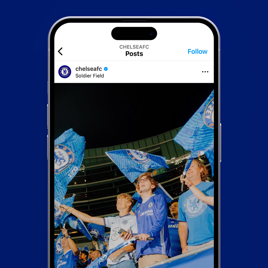
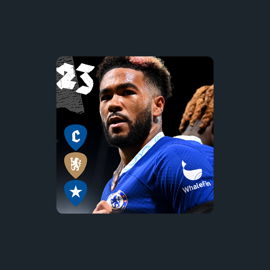
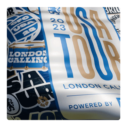
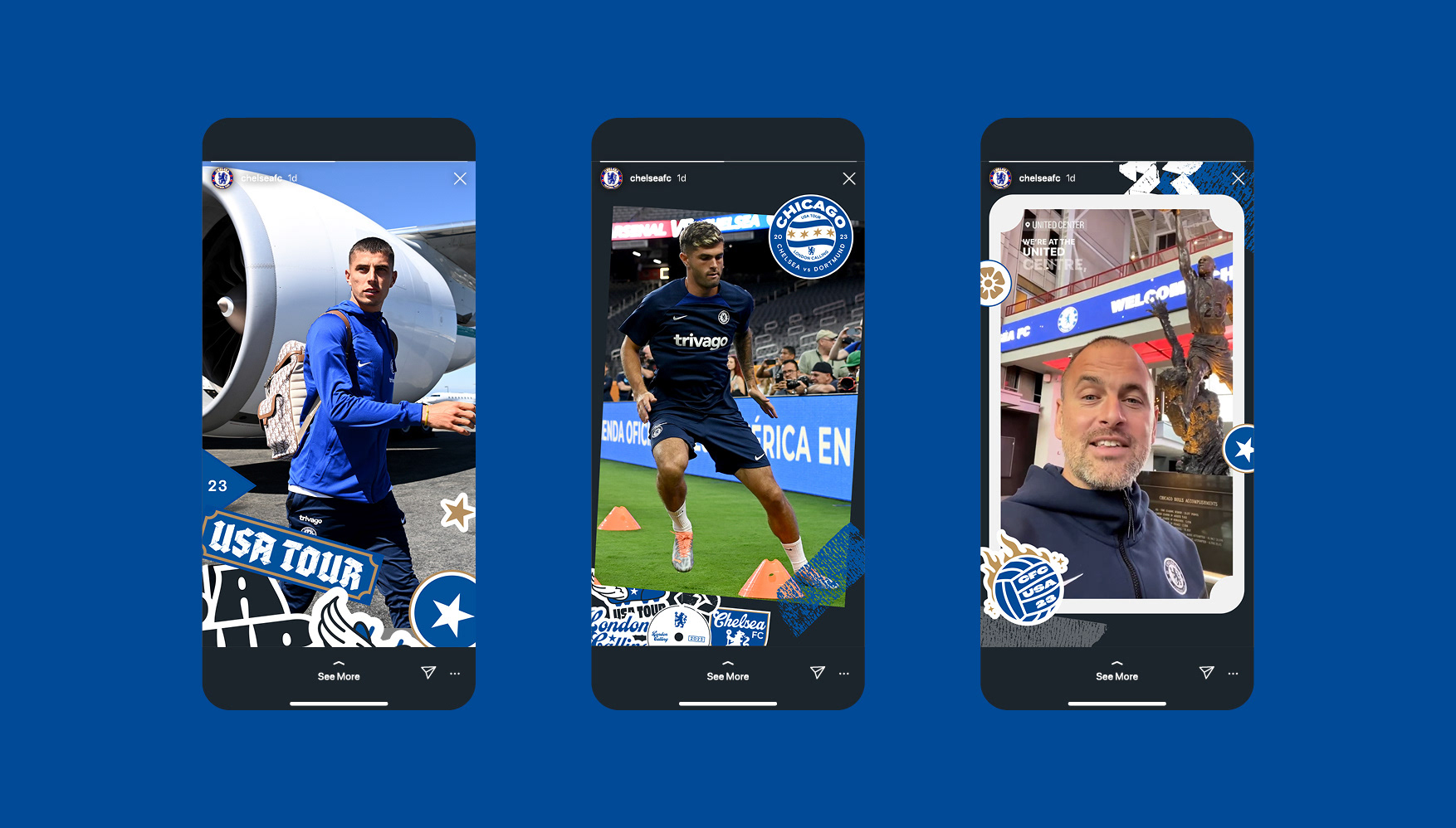
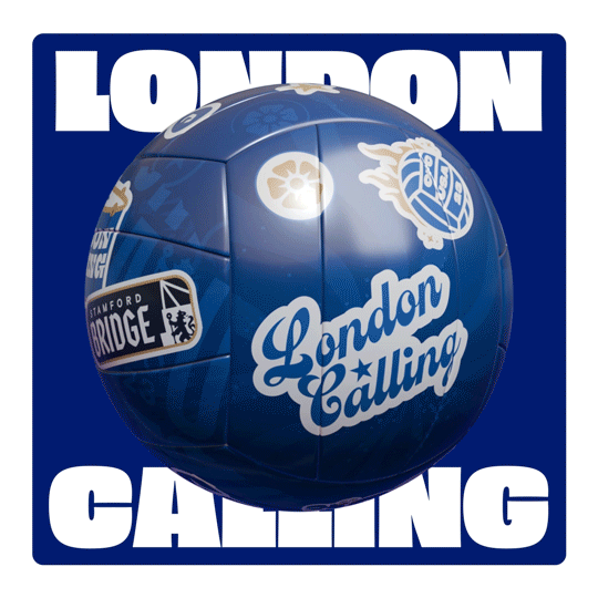
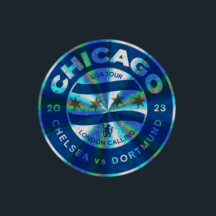
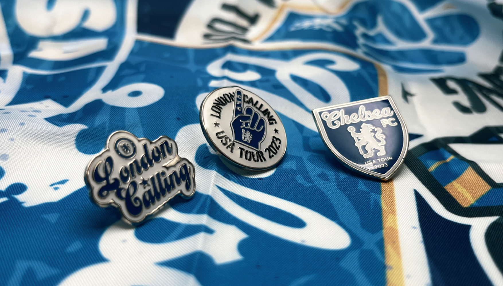
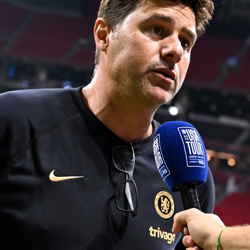
The project spanned over 4 months and I was the sole designer for it. Assets included 6 bespoke illustrated posters, concert staging, 50+ pitchside LEDs, social templates, pin badges, flags, and lots more! Resulting in a cohesive look and feel that was celebrated by our fans in the US.
Services
· Creative Direction
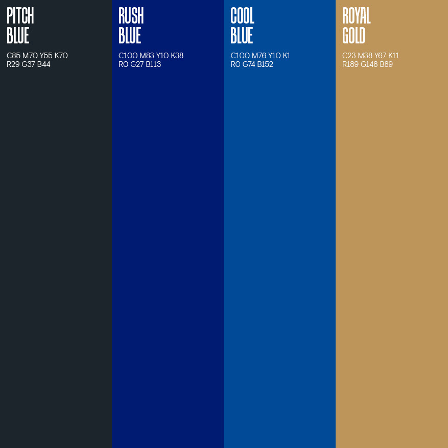
· Visual Identity & Guidelines
· Logo Design
· Illustration
· Asset Rollout
· Artworking
· Print Production
· Visual Identity & Guidelines
· Logo Design
· Illustration
· Asset Rollout
· Artworking
· Print Production
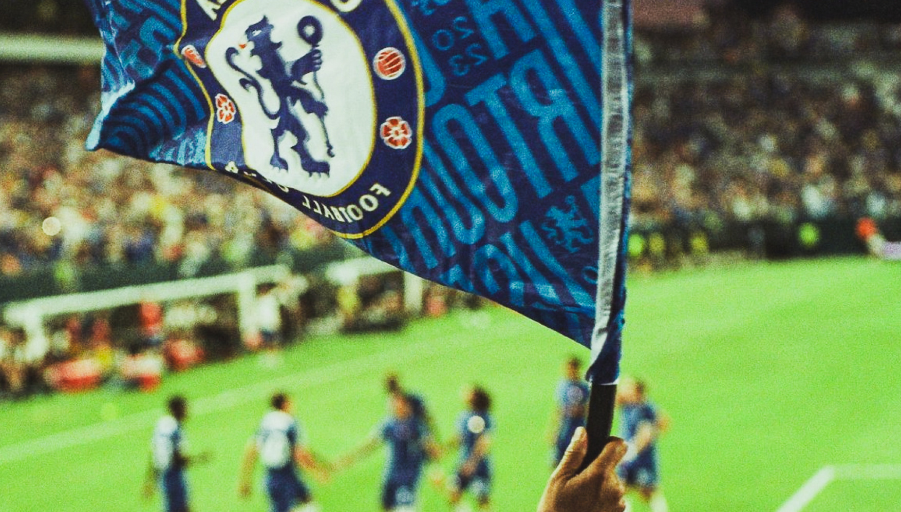
Please note: all photography from the tour was taken by the club photographers.